In the development and building of a shared, open, collaborative network, efforts have come and gone over the years for the Fediverse. We dig into the history, various attempts, and some of the ideas people have had.
Just recently read your 2017 article on the different parts of the “Free Network”, where it was new to me just how much the Star Trek federation was used and invoked. So definitely interesting to see that here too!
Aesthetically, the fedigram is clearly the most appealing out of all of these. For me at least.
It seems though that using the pentagram may have been a misstep given how controversial it seems to be (easy to forget if you’re not in those sort of spaces). I liked the less pentagram styled versions at the bottom. I wonder if a different geometry could be used?
The quality about the fediverse that I appreciate the most is the fact that nobody on any of its platforms raised an eyebrow at having a rainbow-coloured pentagram for a logo, until the first Twitter exodus when some newcomer primed for spotting the mildest of outrage-by-proxy gasped, “Have you seen this? Somebody might get upset!”
Meanwhile, the pentagram has been warding off hyperbolic fundamentalists since 2018. The fediverse is much chiller without them. 🤘
Oh yea I hear you.
⁂ is great!
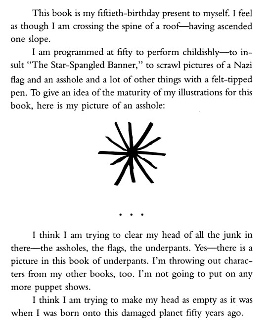
Clearly a network of cat assholes. I feel represented.
Someone pointed out to me how the asterism symbol (the variant the website used) looks like four cat butthole. I can never unsee that.

I don’t know who wrote this book, but he is a genius.
Fucking amazing book, I laughed so hard from start to finish.
I dig that fedi origami logo.


