CH3DD4R_G0B-L1N
Blood rain, giblets, and spent bullet casings
Mild, sharp, and sharper cheese tastings
Metal dudes shredding their taut guitar strings
These are a few of my favorite things
- 3 Posts
- 8 Comments
 2·1 year ago
The new design is almost 100% success in my eyes. The controller input UI is the stain on Steam UI/UX department. It is simply nothing but a downgrade from the classic UI. Technically not a part of this update, but it was all informed by the steam deck overhaul. So I count it as the only miss out of this whole wave of updated looks.
 2·1 year ago
Interesting name you got there
 2·1 year ago
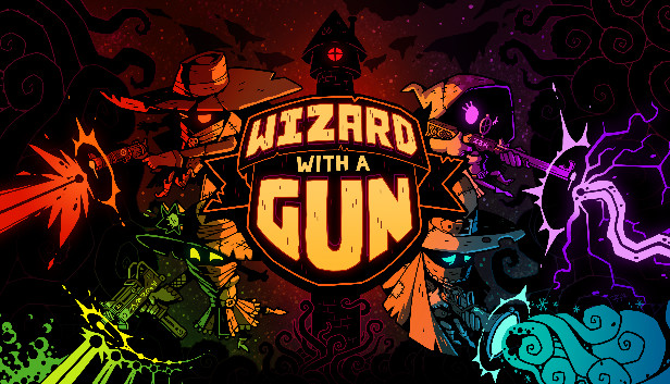
It’s free to try, do it.
My favorite thing was its more roguelite than roguelike. There is defined, achievable progression and you can choose to risk your loot for more reward or play it safe and go a little slower. That’s probably the piece of the puzzle that’s been missing for me from this genre.
 3·1 year ago
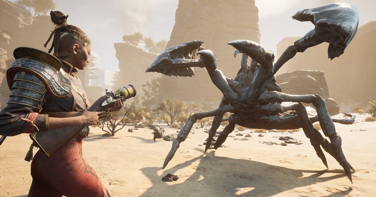
ACG has a preview vid from a bit ago for an outside perspective: ACG Atlas Fallen Preview
This comment proves there is such a thing as the perfect answer.

 2·1 year ago
Love the new overlay. And all the pages load so much noticeably faster, its great.
Wish the new News button next to notifications took you directly to your news instead of Steam only. Keeps my news 2 clicks away. Minor gripe.
And I still firmly believe the Controller Input redesign is outright bad, like no redeeming quality over classic. But It was previewed before this, so not really a knock on this update.
So someone else has played and enjoyed Pyre. Good to know.


that has all kinds of engaging dialouge. The story and characters is a huge piece of the appeal.